Logo Design
Designed for UR Badminton, URCSSA, Teamond, and Phoenix Fire
Logos are designed based on the organization’s brand image and their preferred logo styles.
Teamond
This is a logo designed for a student entrepreneurship program called “Teamond”, a student-run food delivery platform that cooperates with local Guangdong cuisine restaurants.
Inspiration
I use the pattern of traditional auspicious clouds and the “Baozi” to show the Chinese background and the food delivery identity. The tea leaf above the Baozi also echo with the organization name.
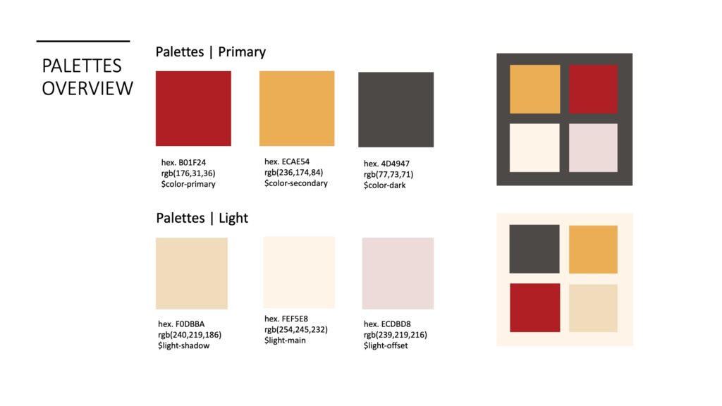
Color schemes
Phoenix Fire
This is a logo designed for a traditional Chinese dance club called “Phoenix Fire”.
Inspiration
The color pick is based on the ancient Chinese myth:”凤象者五,五色而赤者凤;黄者鹓鶵;青者鸾;紫者鸑鷟,白者鸿鹄“. This basically means that the phoenix might show five different colors “red, cyan, yellow, purple, and white”.
Among these, red and cyan are the most common colors and thus I use these two as the main theme.


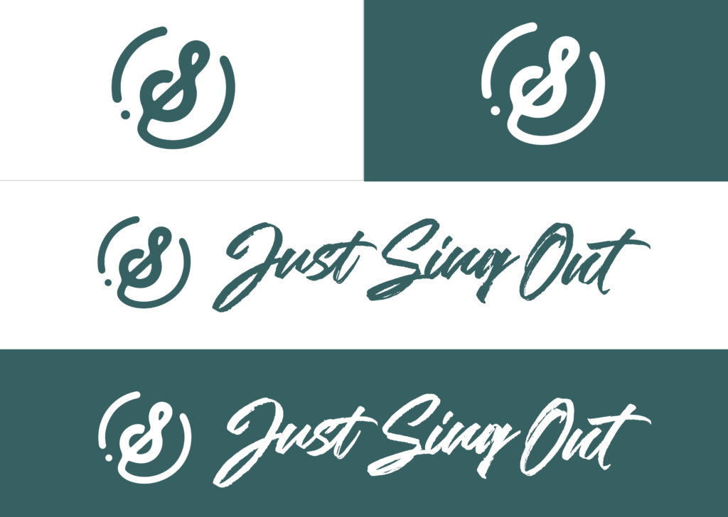
Just Sing Out
This is a logo designed for my DMS senior capstone project.
Inspiration
The logo is inspired by the sign of G-clef, “S” from “Just Sing Out,” and a half-shaped violin. All these are elements related to music that aligns with the function of our website. The main style for the logo design is simplicity; we wanted to use simple curves and lines to create the design.
For the typography used in the logo, we wanted a feeling of hand-written notes. Since our website’s main purpose is to provide transliteration, we wanted to play with the idea of “words” and “scripts.” Furthermore, since the logo is very simple, a more complicated font will provide visual contrast between the two elements.
Color schemes for the whole capstone project


URCSSA
This is a geometrical version designed for URCSSA. This logo is used on the badge, stamp, and accessories.
Inspiration
The two requirements of this geometrical logo are that: the shape should be carved-friendly, and it can represent the “URCSSA” identity.
